The power of petrol logos lies in their ability to create strong associations with quality and loyalty. They act as shorthand for a company’s reputation and experience within the industry. In an era where competition is fierce, a visually appealing logo can attract customers by fostering familiarity while standing out among competitors’ offerings. If done right, it can even evoke nostalgia or pride among loyal customers who have forged meaningful connections with a particular brand throughout their lives. As such, these icons bear immense weight in shaping both consumer behavior and market trends within the petrol industry.
Logos play a crucial role in the petrol industry, not only as a representation of the brand but also as a symbol of trust and reliability. These logos serve as visual identifiers that differentiate one company from another. However, their significance goes beyond mere branding; they act as potent reminders of an ever-changing industry. One can observe a significant evolution in petrol logos over time. From simple designs that emphasized the product itself to more intricate and stylized imagery, these logos mirror the advancements in technology, fuel types, and environmental concerns. Moreover, they embody the values and ideologies tied to each brand’s identity.
Origins of Petrol Logos

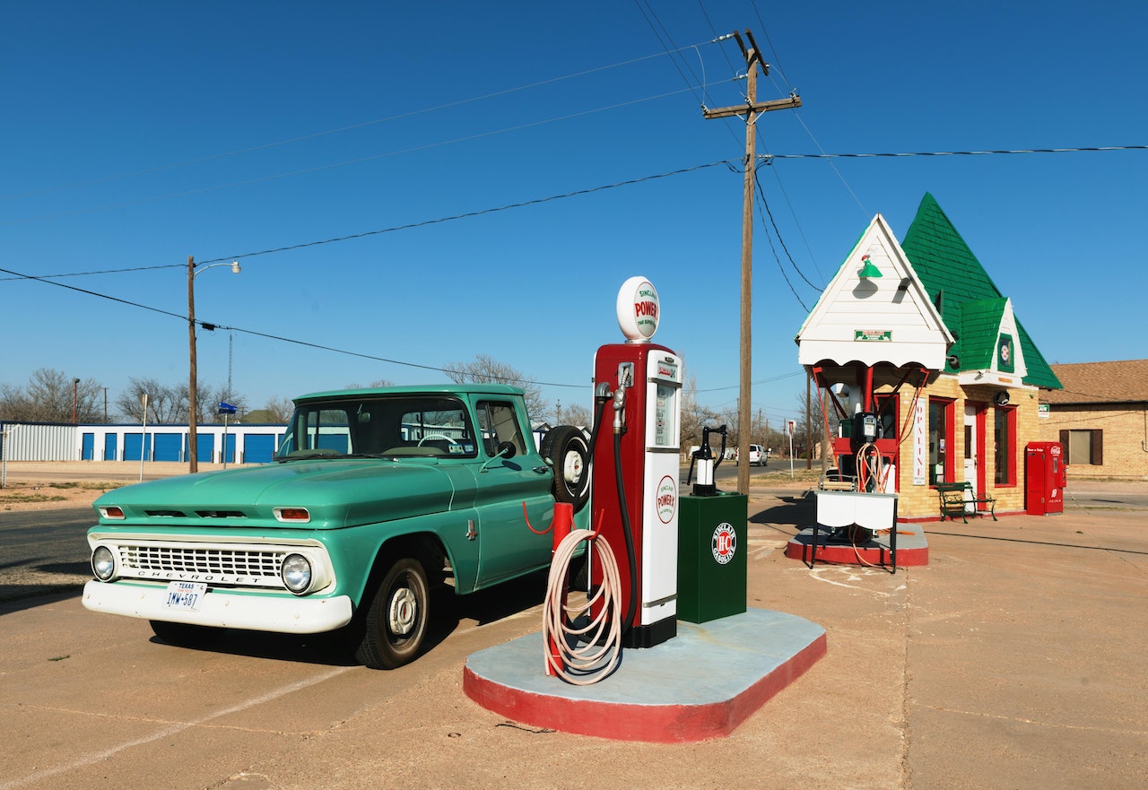
The early days of petrol logos are a fascinating glimpse into the history of the automotive industry. In the late 1800s and early 1900s, as cars became more popular, petrol stations started popping up across the country. These stations needed a way to stand out and attract customers, so they began creating unique logos to represent their brand.
One of the earliest petrol logos was created by Standard Oil Company in 1906. The logo featured a yellow circle with Standard written inside it. This simple yet effective design quickly became recognizable and synonymous with quality fuel. Another iconic petrol logo from this era was that of Texaco, which was founded in 1901. Their original logo featured a red star with Texaco written inside it. This bold and eye-catching design helped establish Texaco as a trusted brand in the minds of consumers.
The origins of petrol logos were driven by the need for recognition and differentiation in an increasingly crowded marketplace. From these humble beginnings, companies like Standard Oil and Texaco set the stage for decades of innovation and creativity in logo design within the petroleum industry.
Recognizable and memorable logos
Iconic designs have the power to instantly bring a brand to mind, and logos are no exception. Some logos have become so recognizable and memorable that they have become ingrained in our collective consciousness. Take the Nike swoosh, for example – a simple yet powerful design that represents athleticism and determination. This iconic logo is instantly recognizable around the world. Another logo that has stood the test of time is the Coca-Cola script. First introduced in 1885, this logo has remained virtually unchanged throughout its long history. The flowing cursive letters evoke feelings of nostalgia and comfort, making it an enduring symbol of America’s favorite soft drink.
One lesser-known but equally iconic logo is that of Shell Oil Company. The yellow seashell with red lettering has been used by Shell since 1904 and continues to be recognized globally as a symbol for quality petroleum products. Its simplicity makes it easily identifiable from afar, making it stand out among other gas station brands. These logos serve as reminders of how powerful design can be in evoking emotions and creating lasting impressions. Whether it’s through bold simplicity or timeless elegance, these memorable logos continue to shape our perception of brands today.
Cultural differences in petrol logos

Petrol logos may not be something that you think about on a daily basis, but they are an integral part of the global fuel industry. What many people don’t realize is that these logos often reflect and embody cultural differences from country to country. Take Shell, for example; their logo with the distinctive yellow and red colors is instantly recognizable worldwide. However, in some countries, such as Pakistan and Indonesia, Shell’s logo features green instead of yellow, catering to cultural preferences. Another interesting case is BP’s logo evolution. While its current green and gold sunflower emblem is now synonymous with the brand, it didn’t start out that way. In fact, BP initially used a shield-like emblem resembling a coat of arms to convey a sense of heritage and trustworthiness. This change in branding strategy reflects not only the company’s desire to modernize its image but also how different cultures respond to certain visual cues.
Cultural differences in petrol logos serve as a reminder that even seemingly small design choices can have a significant impact on global perception. Logos are more than just pretty pictures; they embody values, evoke emotions, and are carefully crafted to resonate with specific audiences. So next time you’re at the pump filling up your tank, take a moment to appreciate the subtle nuances of petrol logos around the world – they’re more than meets the eye.
The future of petrol logos
The future of petrol logos looks promising as brands continue to embrace innovation and adapt to changing consumer demands. With advancements in technology, we can expect to see more dynamic and interactive logos that capture the attention of drivers on the road. Augmented reality (AR) has already started making its way into petrol logos, allowing customers to experience a unique visual representation of the brand when they visit fuel stations. As sustainability becomes a top priority for both consumers and companies, we can anticipate an increased focus on eco-friendly designs in petrol logos. Brands may incorporate elements that highlight their commitment to renewable energy sources or emphasize their efforts in reducing carbon emissions. This not only adds value to their brand image but also resonates with environmentally conscious customers who are actively seeking out products and services that align with their values.
While it is difficult to predict exactly what the future holds for petrol logos, it is certain that brands will continue striving for differentiation and relevance in an ever-changing market landscape. As new technologies emerge and consumer preferences evolve, petrol logos will inevitably transform alongside these changes. By leveraging innovation and staying attuned to customer needs, brands have the opportunity to create iconic logo designs that leave a lasting impression on drivers while embodying their unique identity in this evolving industry.